
Every year the ‘color of the year’ is announced by paint manufacturers. Here are a few articles you can read to get a peek.
https://www.housebeautiful.com/room-decorating/colors/a21345163/color-trends-2019-sherwin-williams/
https://people.com/home/ppg-2019-color-of-the-year/
https://www.behr.com/consumer/inspiration/2019-color-trends/
Here is the reality; each manufacturer has a different color chosen, each with their own supporting reasons why. When selecting colors to surround yourself with in your home, the trends or ‘color of the year’ is not important. What is important is that the colors you chose make you feel the way you want, and your spaces look the way you like.
To help you figure that all out, read the guest post shown below which calls out the major primary and secondary colors and describes the impact they have on us psychologically and physically.
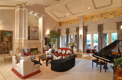
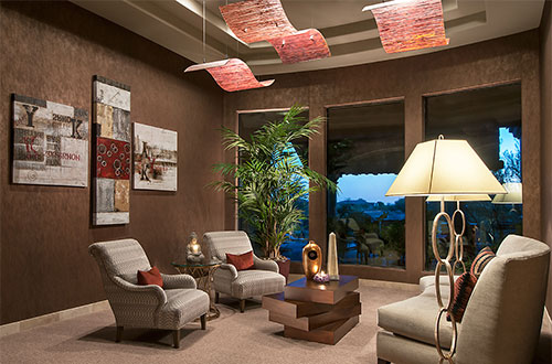
Of course you can call on an interior designer to help you determine which colors to use in your homes and work place. If you are located in the Scottsdale/Phoenix area S Interior Design would love to assist you.
Color Psychology and Decor
When you are repainting the interior of your home, the last thing you should be concerned about is a color trend. Trends in the world of colors will come and go, but the color you put on your wall will have an effect on your mood, thoughts, behavior, feelings, and emotions on a daily basis.
The impact that color has on our lives has been studied since the middle ages. Therefore, it has become a crucial factor when it comes to interior design and decor. When choosing a wall color that you like, it is best to keep color psychology in mind so that you can blend it into a pleasing combination that reflects your personality. The best way to go is to understand what kind of effect each color might have in your home.
Red
An excellent way to raise the energy level of your room is to implement the red color by painting walls in a red hue or adding accent through furniture and decor. Red is known for raising the blood pressure, speed respiration and heart rate. Therefore, it might be too stimulating for bedrooms during the day.
For a youthful feel, you can use light red, while dark red invokes power and durability. An accent of red in the dining room can help to stimulate conversation, and in the entryway, it will give a strong first impression.
Orange
Another color that increases energy is orange, which can make you feel energetic, adventurous and friendly. So if you want to evoke excitement and enthusiasm in a room, you can use orange in your decor or the walls. Rooms with a monochrome, neutral tone, or brown hues can get a nice lift from orange.
Yellow
Yellow is an excellent choice if you want to increase the feeling of happiness, joy, and brightness, but too much yellow can also cause the opposite effect. If the color yellow is not used correctly, it can over stimulate and evoke anger. For example, studies have found that babies cry more in yellow rooms.
Yellow used in a soft tone will work better to stimulate nerves and purify the body. Its uplifting effect can enhance kitchens, dining rooms, and bathrooms and it will make halls and entries feel more welcoming and spacious.
Blue
Blue gives a calming, relaxing and serene feeling because it is believed to bring down blood pressure and decrease heart rate. Soft shades of blue are perfect for bedrooms and bathrooms if balanced with furniture and fabrics that are in a warmer hue. Warmer blues can create a relaxing atmosphere in social areas. However, be careful of dark blue as it can bring up the feeling of sadness.
Green
Green paint and decor can be used in any room of the home because it is the color of nature which symbolizes abundance. It can also be combined with other colors to help increase the feeling of relaxation while relieving stress. In the bedroom in a light tone, it can improve your rest, and in the bathroom, it will give a sense of freshness, and in the living room, it will promote comfort.
Opt for accents of green if you don’t want to paint your walls in green tones, plants and herbs are another way to bring in the color green without overdoing it.
Purple
If you want a dramatic look and the feeling of luxury, elegance, and romance, then purple is an excellent choice that works well with other colors. It can be paired with different jewel tones like emerald-green for example. Lavender and lilac will make your bedroom feel restful without feeling chilly. Dark purple can be used through decor or an accent wall to improve the scheme depth and provide the feeling of sophistication.
Neutrals
Blacks, white, gray and brown are primary colors used in decor. By adding and subtracting these tones, you can control the amount of energy that goes into each room. Black is excellent for some depth in the room, and even a touch of black can ground the overall color scheme.
White is the most versatile color that can be used in all rooms and will give a refreshing, clean, airy and purifying feel. There are however many shades of white available. Bright white, for example, will feel livelier while you can add some warmth with an off-white tone.
Gray makes a great base color when used in a light tone. Gray can add some elegance and formality to the room. Areas without much light might not be suited for gray as it can give the sense of gloominess.
Brown is mostly used in furniture and textiles which brings in a rustic and earthy feel. It is great to use in areas where you want to increase the sense of security and stability. Brown is a warm color which can be a great neutral base color for a room. It works well in studies.
Final Thoughts
If you are not sure where to start, then you can take a color match personality test to ensure that you are comfortable with your color options. A bold, passionate person might feel at ease in a red room, while a shy person might feel uncomfortable surrounded by an over a load of orange.
Choosing the right colors during your interior decorating can be a challenge. However, it is one of the most accessible home improvements that one can make, and if you do it right, you will create a unique atmosphere to live in.
Author: Mattea Jacobs
Short bio:
Mattea Jacobs is a freelance writer who mostly writes about both interior and exterior home design, and environmentally friendly ways to improve homes. She is also a green activist and a mother of two beautiful sons. You can reach her on Facebook and Instagram.