Interior Design Scottsdale, AZ by S Interior Design

Premium Interior Design

Large Format Porcelain Tile
  • Home
  • Design Services
  • Our Story
  • Gallery
  • Testimonials
  • Blog
  • Press
  • Contact

2021 COLOR TRENDS & MORE

November 3, 2021 by Suzanne Lasky

S Interior Design was recently interviewed on the topic of the hot colors for 2021. In summary, colors are warmer and draw inspiration from nature with a lot of green tones which evoke thoughts of new beginnings and life. Take a read of the entire article here:

https://www.fixr.com/blog/2021/10/27/color-of-the-year-2022/

The article itself is entitled “Color Me Comforted”. We all are seeking the feeling of comfort and safety in what continues to be challenging times due to health and economic conditions.

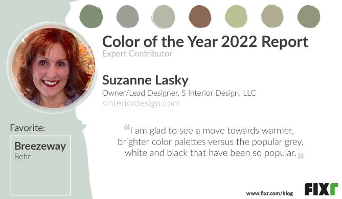
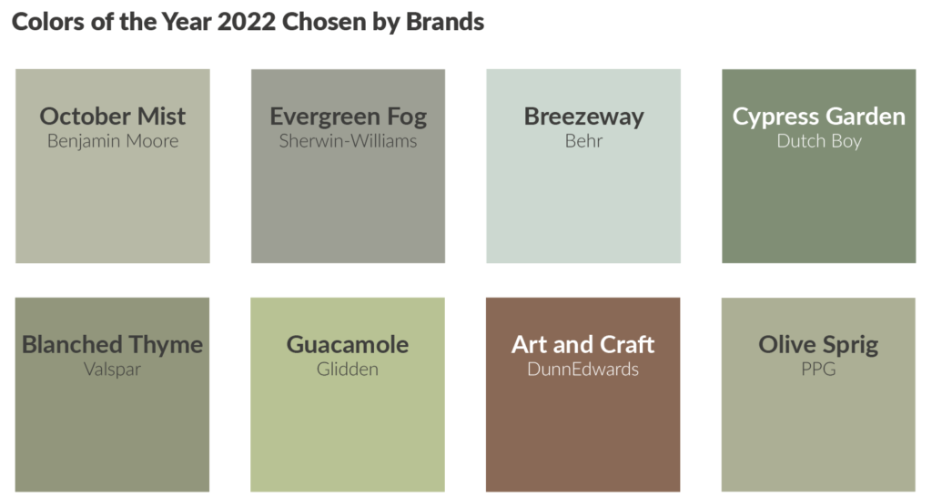
As written in the article an interesting difference in this years’ color picks by the major paint manufacturers versus prior years is the similarity in the selections versus the usual push to differentiate themselves from each other .

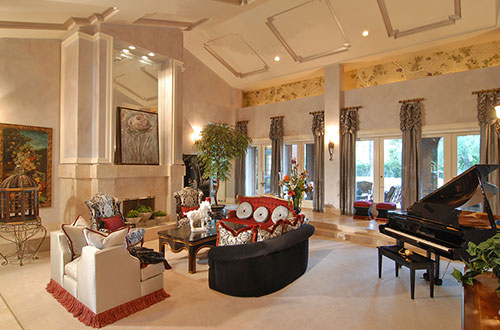
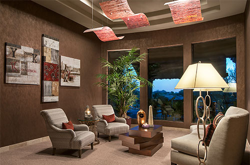
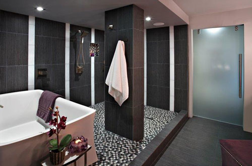
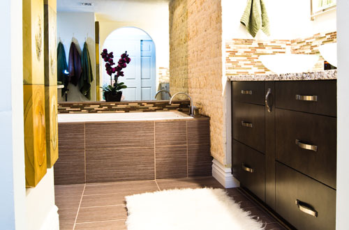
Other note worthy trends are the continued interest in textures and organic shapes. Hard right angles are being joined by curves in upholstered furniture and accent pieces. Natural materials are found in everything from area carpets to light fixtures and of course accessories.

The trade magazine Furniture, Lighting and Decor published this in their November issue:
https://mydigitalpublication.com/publication/?m=44489&i=726158&p=22&ver=html5

One thing that isn’t new is the fact that one of the quickest and easiest things to do to your interiors is to change the paint color on the walls. So, if you want to go with the trend, or you just want a change, maybe it is time for you to do that in your home. As always, S Interior Design is here to assist you in making your paint color selections.

Filed Under: Trends Tagged With: 2021 Design Trends, 2021 Paint Color Treands, color trends, design trends, paint color trends, S Interior Design Scottsdale Arizona

Color Trends 2017

August 17, 2016 by Suzanne Lasky

gallery-1457630964-index-pantone-paint-colors

Every year new color trends are introduced in the world of design.  Pantone, leads the pack as a color spotting expert, and all of the major paint color manufacturers follow suite with their won interpretations and insights.  Below is Pantones predictions on color trends in 2017.  Changing the colors of your walls, flooring, art work and accessories can make a big change in the way your home looks and feels. S Interior Design customizes color recommendations for their clients based on their specific likes and dislikes, trends are the least considered variable

Pantone unveils 2017 color trends for interiors

Nine palettes revealed at International Home + Housewares Show

Home Accents Today Staff — Home Accents Today, March 10, 2016

Pantone interiors 2017_w
Pantone Executive Director Leatrice Eiseman shared the color institute’s latest forecast for home interiors during her annual seminar at the International Home + Housewares Show this week.

After sharing some general color trends and influences, Eiseman unveiled the nine color palettes for 2017 from Pantone View Home + Interiors.

“We are all familiar with consumers’ constant desire to see something new, yet they still want, in many cases, to have somewhat of a familiar comfort level,” Eiseman said. “We have to assess our customers’ aspirations by using credible forecasts as a guide to invigorated color design palettes that will inform and encourage new color directions. The question is: What can we do to tweak our color palettes to make consumers stop and take notice?”

The 2017 Pantone View Home + Interiors palettes are:

Day Dreaming – This palette is a continuation of the Color of the Year pastel theme, with colors that evoke thoughts that are light and weightless….in contrast to the heaviness of day-to-day stresses. A key here is that other colors, such as Yellow Iris and a Nile green, are used to expand on the blue and pink.

At Ease – A step from Day Dreaming, At Ease is grayed down for more of a sophisticated feel. A variety of ever popular neutrals, both cool and warm, are blended with muted tones in a way that seems effortless.

Native Instincts – Style-wise, current and future forecasts point to a homogenous mix of design and color where a piece of Native American pottery is compatible with a Turkish kilim carpet and/or a pre-Columbian artifact. Likewise, this palette offers bold colors like a smoky orchid and a Carmine red along with softer Earth tones.

Florabundant – Just like its name implies, Florabundant is filled with the sumptuous beauty of rich floral hues. This palette offers a lot of drama from Pink Yarrow, Chrysanthemum, Red Dahlia and Baton Rouge and includes varying shades of green.

Acquired Taste – In both food and surroundings, an acquired taste means an appreciation for the distinctively different. Such is the case with this palette which offers a mix of colors and/or textures not commonly seen together, yet they combine for a palette that is subtly luxurious. Colors include Orange Chiffon, Pale Gold, Mulberry, Brandied Melon, a dove gray and a muted pink.

Forest Bathing – This stress-reducing palette is inspired by the Japanese practice of “Shinrin-yoku” or forest bathing. Studies have shown that a contemplative walk in the woods reconnects the individual with nature and elevates their mood. Several shades of green and blue-green are enlisted, which are contrasted by Grape Kiss and a refreshing Acid Lime.

Reminiscence – A different kind of walk – a walk down memory lane – is the mood conveyed here. Traditional shades like Maritime Blue, Sepia Tint and Rattan convey a sense of nostalgia and stability, but the mix of new colors like murky Martini Olive and Bird’s Egg Green keep the palette feeling fresh.

Raw Materials – Both the re-use and re-purposing of materials from nature and the health and wellness movement are represented in this palette. Zephyr Pink offers an unexpected pop of color against the many, more natural tones.

Graphic Imprints – Described by Eiseman as “great fun,” this palette starts with a base of black and white but then pulls in a series of strong, vibrant colors with names that tell a story themselves: Blazing Yellow, Dazzling Blue, Prism Pink, Fandango Pink, Opaline Green and Orange Popsicle.

Read more about Eiseman’s presentation at the International Home + Housewares

Filed Under: Accessories, Colorization, Design Elements, Design Trends, Paint Color, Redesign, Renovation, Residential design, S Interior Design Scottsdale, staging homes, Uncategorized Tagged With: color, color trends, Paint Color, paint color trends

Call today to schedule your design consultation.

480-220-4659

66 Reviews for S Interior Design

Suzanne Lasky in Scottsdale, AZ on HouzzSuzanne Lasky in Scottsdale, AZ on HouzzBest of Houzz Service 2020Best of Houzz Service 2019Best of Houzz Service 2018Best of Houzz Service 2017Best of Houzz Design 2016Best of Houzz Design 2015

Click to see over 70 of our latest interior design projects.

S Interior Design Featured on Houzz
Houzz

Yelp Reviews

S Interior Design

Top 3 Interior Designers Scottsdale, AZ

Best Interior designers in Scottsdale

Subscribe to Blog via Email

Enter your email address to subscribe to this blog and receive notifications of new posts by email.

Join 4,918 other subscribers

sign-up

Copyright © 2022 · Lifestyle Pro Theme on Genesis Framework · WordPress · Log in