Interior Design Scottsdale, AZ by S Interior Design

Premium Interior Design

Large Format Porcelain Tile
  • Home
  • Design Services
  • Our Story
  • Gallery
  • Testimonials
  • Blog
  • Press
  • Contact

Color Trends 2017

August 17, 2016 by Suzanne Lasky

gallery-1457630964-index-pantone-paint-colors

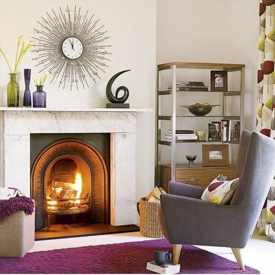
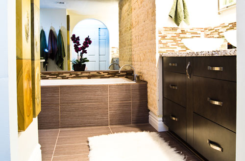
Every year new color trends are introduced in the world of design.  Pantone, leads the pack as a color spotting expert, and all of the major paint color manufacturers follow suite with their won interpretations and insights.  Below is Pantones predictions on color trends in 2017.  Changing the colors of your walls, flooring, art work and accessories can make a big change in the way your home looks and feels. S Interior Design customizes color recommendations for their clients based on their specific likes and dislikes, trends are the least considered variable

Pantone unveils 2017 color trends for interiors

Nine palettes revealed at International Home + Housewares Show

Home Accents Today Staff — Home Accents Today, March 10, 2016

Pantone interiors 2017_w
Pantone Executive Director Leatrice Eiseman shared the color institute’s latest forecast for home interiors during her annual seminar at the International Home + Housewares Show this week.

After sharing some general color trends and influences, Eiseman unveiled the nine color palettes for 2017 from Pantone View Home + Interiors.

“We are all familiar with consumers’ constant desire to see something new, yet they still want, in many cases, to have somewhat of a familiar comfort level,” Eiseman said. “We have to assess our customers’ aspirations by using credible forecasts as a guide to invigorated color design palettes that will inform and encourage new color directions. The question is: What can we do to tweak our color palettes to make consumers stop and take notice?”

The 2017 Pantone View Home + Interiors palettes are:

Day Dreaming – This palette is a continuation of the Color of the Year pastel theme, with colors that evoke thoughts that are light and weightless….in contrast to the heaviness of day-to-day stresses. A key here is that other colors, such as Yellow Iris and a Nile green, are used to expand on the blue and pink.

At Ease – A step from Day Dreaming, At Ease is grayed down for more of a sophisticated feel. A variety of ever popular neutrals, both cool and warm, are blended with muted tones in a way that seems effortless.

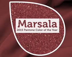
Native Instincts – Style-wise, current and future forecasts point to a homogenous mix of design and color where a piece of Native American pottery is compatible with a Turkish kilim carpet and/or a pre-Columbian artifact. Likewise, this palette offers bold colors like a smoky orchid and a Carmine red along with softer Earth tones.

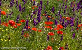
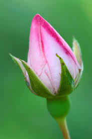
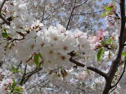
Florabundant – Just like its name implies, Florabundant is filled with the sumptuous beauty of rich floral hues. This palette offers a lot of drama from Pink Yarrow, Chrysanthemum, Red Dahlia and Baton Rouge and includes varying shades of green.

Acquired Taste – In both food and surroundings, an acquired taste means an appreciation for the distinctively different. Such is the case with this palette which offers a mix of colors and/or textures not commonly seen together, yet they combine for a palette that is subtly luxurious. Colors include Orange Chiffon, Pale Gold, Mulberry, Brandied Melon, a dove gray and a muted pink.

Forest Bathing – This stress-reducing palette is inspired by the Japanese practice of “Shinrin-yoku” or forest bathing. Studies have shown that a contemplative walk in the woods reconnects the individual with nature and elevates their mood. Several shades of green and blue-green are enlisted, which are contrasted by Grape Kiss and a refreshing Acid Lime.

Reminiscence – A different kind of walk – a walk down memory lane – is the mood conveyed here. Traditional shades like Maritime Blue, Sepia Tint and Rattan convey a sense of nostalgia and stability, but the mix of new colors like murky Martini Olive and Bird’s Egg Green keep the palette feeling fresh.

Raw Materials – Both the re-use and re-purposing of materials from nature and the health and wellness movement are represented in this palette. Zephyr Pink offers an unexpected pop of color against the many, more natural tones.

Graphic Imprints – Described by Eiseman as “great fun,” this palette starts with a base of black and white but then pulls in a series of strong, vibrant colors with names that tell a story themselves: Blazing Yellow, Dazzling Blue, Prism Pink, Fandango Pink, Opaline Green and Orange Popsicle.

Read more about Eiseman’s presentation at the International Home + Housewares

Filed Under: Accessories, Colorization, Design Elements, Design Trends, Paint Color, Redesign, Renovation, Residential design, S Interior Design Scottsdale, staging homes, Uncategorized Tagged With: color, color trends, Paint Color, paint color trends

Design Cues from Nature

April 22, 2015 by Suzanne Lasky

Today is Earth Day.  I thought it relevant to talk about how nature can provide fabulous direction for Interior Design. 

earth dayEarly this morning I dug up some beets from my raised garden bed.  I took the time to really look at the marvel that had been produced from a tiny seed.  The color of the beets are very on trend right now.
They are the color of Marsala–Pantone’s 2015 Color of the Year.

marsala color of the yearBeets

And nature shows us what other colors work beautifully with Marsala–a rich organic green is the perfect complimentary color.  After all, red and green are compliments on the color wheel and the two tones of those colors are the same saturation level.

Beyond the color of the beets, their stems, and leaves, I also took the time to examine the contours and shapes of the beet and it’s stems and leaves.

I have often said the easiest way to check it color combinations will work well together is to look to nature.  Flowers, trees, shrubs all seem to magically grow and bloom in just the right colors.

flowers 2 flowers 3flowering tree

ColorWheel1

Filed Under: Colorization, Eath Day, Interior Design Tagged With: color of the year, color wheel, earth day, Green Design, Interior Design, marsala, Paint Color, S Interior Design, Scottsdale, sustainable design

Paint Color 2013

December 3, 2012 by Suzanne Lasky

color wheel

Are you considering doing some painting around your house or office in the coming year?  Here are ideas to consider based on  2013 Color ‘discussions’ by some of the leading paint companies.
In a sentence–“Look for a lot of variety and contrast to be popular in 2013.”

Sherwin Williams, Dunn Edwards, Benjamin Moore, Behr and Pantone all have published their predictions for what the popular paint colors and combinations of colors will be in the coming year. 

color links


dunn edwards color

benj moore colors


Benjamin Moore: Intersection– Flow, Cycle, Animate, Connect 

Sherwin Williams: Opposites Attract–Midnight mystery, Honed Vitality, Vintage Moxie, High Voltage

Dunn Edwards: A New Renaissance Influences Palette and Textures–Simply Re-invented, Simply Re-newal, Simply Re-imagined and Simply Re-vival.

Behr:  Watch this short video!

pantone 2013 blues


Pantone   According to the PANTONE VIEW home + interiors 2013 book, there are nine color palettes predicted to dominate interior design and furniture trends in 2013. A mix of muted palettes serve as the new classics while rainbow-inspired colors provoke bolder style statements.     Note:  From the Casa Sugar Blog

ff9c2870ab5615ec_flower-power.xxxlarge_1

Before you begin your  painting, it is always a good idea to try your color choices on several walls in the room.  Different walls have different levels of light reflection and the colors will look a bit different in different spaces due to the levels and types of light they will have.  We recommend at least a 3′-0″ x 3′-0″ square on the wall.  If the wall already has paint color on it, we also recommend priming before putting the new paint color up.

Of course S Interior Design is always available to help in the Phoenix metro area!

Filed Under: Accessories, Area Rugs, Artwork, Bathroom Remodel, Bedding, Bedroom Design, Colorization, Commercial Design, Design Elements, DIY, Home Remodelling, Home Staging, Interior Design, Paint Color, Redesign, Renovation, Residential design, Wall Decor Tagged With: Color For Your Home, Color Trends 2013, Paint Color, S Inteiror Design, S Interior Design Scottsdale Arizona

Does Your Child Have the Bedroom of Their Dreams?

March 6, 2012 by Suzanne Lasky

Here’s another great guest blog with some wonderful tips for designing a room for a child. This blog identifies the major areas of design and offers some interesting solutions. Give it a read and let us know if you agree with their creative ideas.

Designing a bedroom for your child can be one of the most fun home projects. You can really get creative and design something that your child will remember forever. So when you design your child’s bedroom, make sure that you have their personality and the things they love in mind. The most important part of your child’s bedroom is the walls. The walls cover a large area of the room and getting them right is critical for the overall design of the room.

Having a theme will help to direct your ideas and unify the room.
The best way to design a kids bedroom is with a theme in mind. Some theme ideas are medieval, cityscape, auto racing, dinosaurs, forest, the universe, and the old west. There are many more of course, but these should give you some ideas. Make sure to get your child’s input when deciding on a final theme. Searching the internet is also a good way of coming up with ideas or getting examples of ideas you have come up with.

Once you have come up with a theme, it is time to get designing. Decorating the walls is the most important because they will set the scene for the entire room. Wallpaper is the best way to decorate the walls in your child’s bedroom. It is easier to find intricate designs children like, it can be removed if they damage it, and it keeps the walls underneath in good shape.

Custom wallpaper is a great way to get just the look you are going for and allows you to be as creative as you want when designing your project.
While there are many great wallpaper designs for children’s rooms out there, you may want something a little more unique, or perhaps you’re not able to find exactly what you are looking for. The best thing to do in this situation is to have custom wallpaper made for your child’s bedroom.

When designing custom wallpaper, you can use any digital photo or digital image as the template for the walls. A single six megapixel photo can be blown up to the size of an entire wall. This means that any photo you have from family vacations, trips to the zoo, baseball games, or pictures of their favorite park can become decorations on your child’s wall.

You are not restricted to photographs either. You can use a graphic design program to design digital images to decorate your child’s walls as well. You could make a cartoon background, a stars and planets scene, or even an alien world.

Once you have designed the walls, it is time to move on to the rest of the room. Choose paint for furniture that matches your theme. Choose carpet that is darker and good at hiding stains. Your child’s bed is another element where you can let your imagination run wild. There are many premade child’s bed designs that are amazing. Of course, if you have the carpentry skills, know someone who does, or can afford to have a bed custom made; you can really get creative.

So, I hope this has given you some ideas on how to make your child’s wildest dreams come true when designing a bedroom for them.

Author Bio: Blake Pearson is a large format printing expert and online publisher for www.megaprint.com  who writes on the topics of design and printing.

About Suzanne Lasky, Allied ASID
Suzanne Lasky, Allied ASID, is the owner and founder of S Interior Design, the exclusive provider of Pawprint Design Services™. Suzanne works with her clients to develop a winning combination of design elements that result in warm, comfortable and functional spaces that reflect each client’s personal style. Suzanne and her team specialize in residential, contract and hospitality interior design, from simple color selections, to office build outs, to restaurant, spa and hotel designs. Suzanne shares her years of expertise through the power of social media. You can follow her on Facebook, Twitter, and at this blog. To speak to Suzanne about your interior design needs, please call 480-220-4659 or visit her website at www.sinteriordesign.com.


Filed Under: Accessories, Artwork, Bedroom Design, Custom Furniture, Design Elements, DIY, furniture, Redesign, Spring Decorating Tagged With: child's bedroom, custom furniture design, Mega Print, Paint Color, S Interior Design, Suzanne Laskey, wallpaper

Exterior House Color Trends

November 12, 2009 by Suzanne Lasky

In the Southwest, Arizona specifically, there is a movement away from the tan, off-white and taupe tones for the exterior paint color of a home or office building.

The harsh Arizona sun makes it challenging to sustain the paint condition of the exterior of your home.  An additional challenge is presented when Home Owners Associations dictate the color palette a home owner may choose their paint colors from.A look at new or recently re-furbished commercial properties (condominiums, apartment complexes, shopping centers) will illustrate the move away from the lighter desert tones TO more vibrant, saturated colors that make a visual design statement and stand up to the harsh environment better.  A trip to any of the new home developments reveal a greater choice of more exciting color options.
Color can be used to highlight or downplay your home’s architectural details (or lack there of).  For example, painting the eaves and fascia the same color as the walls will make a short building look taller, while painting them the same color as the roof will make a tall building look shorter.  Columns, pop-out window details or trim can be highlighted with accent color to draw the eye towards them.

If there is an interior design question you would like
S Interior Design to address, please submit it to us at :
suzanne@sinteriordesign.com

Filed Under: Colorization, Commercial Design, Interior Design, Paint Color, Residential design, Uncategorized Tagged With: Colorization, Paint Color

  • 1
  • 2
  • Next Page »

Call today to schedule your design consultation.

480-220-4659

67 Reviews for S Interior Design

Suzanne Lasky in Scottsdale, AZ on HouzzSuzanne Lasky in Scottsdale, AZ on HouzzBest of Houzz Service 2020Best of Houzz Service 2019Best of Houzz Service 2018Best of Houzz Service 2017Best of Houzz Design 2016Best of Houzz Design 2015

Click to see over 70 of our latest interior design projects.

S Interior Design Featured on Houzz
Houzz

Best of HOUZZ SERVICE 2023

Suzanne Lasky in Scottsdale, AZ on Houzz

Yelp Reviews

S Interior Design

Top 3 Interior Designers Scottsdale, AZ

Best Interior designers in Scottsdale

Subscribe to Blog via Email

Enter your email address to subscribe to this blog and receive notifications of new posts by email.

Join 4,917 other subscribers

sign-up

Copyright © 2023 · Lifestyle Pro Theme on Genesis Framework · WordPress · Log in