Interior Design Scottsdale, AZ by S Interior Design

Premium Interior Design

Large Format Porcelain Tile
  • Home
  • Design Services
  • Our Story
  • Gallery
  • Testimonials
  • Blog
  • Press
  • Contact

3 Top Interior Design Tips to Sell Your Home Faster

June 5, 2018 by Suzanne Lasky

While this is not new ‘news’  it is a concise summary of the key steps a home seller should be considering when placing their home on the market to sell.  Selling and buying a home is an emotional process.  Sometimes it is challenging for you the seller who has lived in a home for many years to emotionally disconnect and view the home from an objective vantage point.

I will add two more important tips; one, make sure the exterior of the house is in tip top shape and there is great curb appeal and two, here in Arizona you want to provide a wonderful back patio so people can imagine themselves living the indoor/outdoor lifestyle they desire.

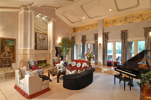
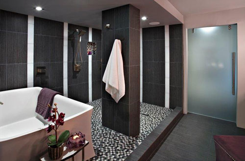
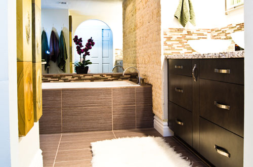
Hiring a professional interior designer or staging company may be money well spent for you to get the price you desire.  See the guest post below for the top tips to get your home in shape prior to being put on the sales market. [Read more…]

Filed Under: Home Staging, Interior Design, Paint Color, Residential design, S Interior Design Scottsdale, staging homes Tagged With: desgin to sell home, moving, S Interior Design Arizona, selling home, stagin ghome, update decor

BASIC DESIGN AND DECOR TIPS

March 22, 2017 by Suzanne Lasky

BELOW IS AN INFO-GRAPHIC THAT COVERS SOME BASIC IMPORTANT DESIGN AND DECOR IDEAS IN AN EASY TO READ FORMAT.  COURTESY OF https://www.choicefurnituresuperstore.co.uk


Filed Under: Accessories, Area Rugs, Colorization, Design and Organization, Design Elements, Design Plan, furniture, home design, Home Staging, Interior Design, Paint Color, Pillows, plants, Renovation, Residential design, S Interior Design, S Interior Design Scottsdale, staging homes Tagged With: easy design ideas, Home deor, home design

Color Trends 2017

August 17, 2016 by Suzanne Lasky

gallery-1457630964-index-pantone-paint-colors

Every year new color trends are introduced in the world of design.  Pantone, leads the pack as a color spotting expert, and all of the major paint color manufacturers follow suite with their won interpretations and insights.  Below is Pantones predictions on color trends in 2017.  Changing the colors of your walls, flooring, art work and accessories can make a big change in the way your home looks and feels. S Interior Design customizes color recommendations for their clients based on their specific likes and dislikes, trends are the least considered variable

Pantone unveils 2017 color trends for interiors

Nine palettes revealed at International Home + Housewares Show

Home Accents Today Staff — Home Accents Today, March 10, 2016

Pantone interiors 2017_w
Pantone Executive Director Leatrice Eiseman shared the color institute’s latest forecast for home interiors during her annual seminar at the International Home + Housewares Show this week.

After sharing some general color trends and influences, Eiseman unveiled the nine color palettes for 2017 from Pantone View Home + Interiors.

“We are all familiar with consumers’ constant desire to see something new, yet they still want, in many cases, to have somewhat of a familiar comfort level,” Eiseman said. “We have to assess our customers’ aspirations by using credible forecasts as a guide to invigorated color design palettes that will inform and encourage new color directions. The question is: What can we do to tweak our color palettes to make consumers stop and take notice?”

The 2017 Pantone View Home + Interiors palettes are:

Day Dreaming – This palette is a continuation of the Color of the Year pastel theme, with colors that evoke thoughts that are light and weightless….in contrast to the heaviness of day-to-day stresses. A key here is that other colors, such as Yellow Iris and a Nile green, are used to expand on the blue and pink.

At Ease – A step from Day Dreaming, At Ease is grayed down for more of a sophisticated feel. A variety of ever popular neutrals, both cool and warm, are blended with muted tones in a way that seems effortless.

Native Instincts – Style-wise, current and future forecasts point to a homogenous mix of design and color where a piece of Native American pottery is compatible with a Turkish kilim carpet and/or a pre-Columbian artifact. Likewise, this palette offers bold colors like a smoky orchid and a Carmine red along with softer Earth tones.

Florabundant – Just like its name implies, Florabundant is filled with the sumptuous beauty of rich floral hues. This palette offers a lot of drama from Pink Yarrow, Chrysanthemum, Red Dahlia and Baton Rouge and includes varying shades of green.

Acquired Taste – In both food and surroundings, an acquired taste means an appreciation for the distinctively different. Such is the case with this palette which offers a mix of colors and/or textures not commonly seen together, yet they combine for a palette that is subtly luxurious. Colors include Orange Chiffon, Pale Gold, Mulberry, Brandied Melon, a dove gray and a muted pink.

Forest Bathing – This stress-reducing palette is inspired by the Japanese practice of “Shinrin-yoku” or forest bathing. Studies have shown that a contemplative walk in the woods reconnects the individual with nature and elevates their mood. Several shades of green and blue-green are enlisted, which are contrasted by Grape Kiss and a refreshing Acid Lime.

Reminiscence – A different kind of walk – a walk down memory lane – is the mood conveyed here. Traditional shades like Maritime Blue, Sepia Tint and Rattan convey a sense of nostalgia and stability, but the mix of new colors like murky Martini Olive and Bird’s Egg Green keep the palette feeling fresh.

Raw Materials – Both the re-use and re-purposing of materials from nature and the health and wellness movement are represented in this palette. Zephyr Pink offers an unexpected pop of color against the many, more natural tones.

Graphic Imprints – Described by Eiseman as “great fun,” this palette starts with a base of black and white but then pulls in a series of strong, vibrant colors with names that tell a story themselves: Blazing Yellow, Dazzling Blue, Prism Pink, Fandango Pink, Opaline Green and Orange Popsicle.

Read more about Eiseman’s presentation at the International Home + Housewares

Filed Under: Accessories, Colorization, Design Elements, Design Trends, Paint Color, Redesign, Renovation, Residential design, S Interior Design Scottsdale, staging homes, Uncategorized Tagged With: color, color trends, Paint Color, paint color trends

Quick Ways to Add Luxury to Your Home

January 22, 2014 by Suzanne Lasky

What does luxury mean to you?  There is not one answer to this question.  It is a personally defined term.  For one person it may be the highest quality bed linens,  for another it means down filled sofas or custom lighting fixtures.    Before you read the guest post below, S Interior Design suggests pondering the question and finding your personal answer. [Read more…]

Filed Under: Design Elements, Design Plan, Interior Design, Residential design, staging homes Tagged With: lux home decor, luxurious homes, luxury design

Transformative Power of Art

May 9, 2012 by Suzanne Lasky

 Trans-formative Value of Art

Below is a guest post about what I will call ‘the power of art’.

S Interior Design uses a generous definition for the word art.  We believe that art should make you smile   when you look at it. So, that said a nicely framed picture of a vineyard you visited could indeed be great art, as could a child’s drawing.  The key is in the presentation—don’t expect a poster thumb tacked to the wall to be pleasing to the eye.  Invest in the proper mat board and framing and you will be amazed at what can happen to your child’s painting from 5th grade.

Guest Post

Although I’ve always been a big fan of interior design it has only been recently that I’ve truly begun to have a full appreciation for the trans-formative values of art. I must confess, I always thought ill of those overly proud of their new painting, sculpture, or art. I was an avid fan of contemporary styles, with a minimalist approach. I was of the opinion that the sleek look, along with sparse furnishing and sharp lines, gave a real clean, organized, powerful aura.

Recently however, I’ve come to appreciate an appropriately placed piece of art. It can add true depth to a room, granting reflection and meaning where previously there was blank space. Whether you feel the way I once did, or share my current views, here is why I now consider art to be a trans-formative agent in a room.

The greatest way in which a piece of wall art transforms living space is adding a depth of reflection. Artwork inspires reflection for various reasons. Mainly for these three:

The art was made by a human being, and you can’t help but reflect on the thoughts of the human behind the art.

This is one of the most powerful ways art makes one reflect. Art, whether through beauty, abstractness, or sheer uniqueness, makes one wonder. To consider that a human made this piece of wonder causes a further wonder that someone was not only able to, but had deeper motives. Humans, being naturally curious, can’t help but reflect and consider what might have been the motivation and thoughts behind the creation.

The wondrous qualities of the artwork itself.

This is often the initial way that artwork causes us to reflect and wonder. It draws the eye, pulls us in, and suddenly, before we know it, we’re standing and reflecting and staring. Thinking about the amazing, unbelievable qualities of beauty, strength, power, subtlety, or whatever aspect the painting best personifies.

The depths of your own imagination.

A surprisingly large portion of artwork plays off the imagination of the viewer. Almost all abstract art relies on the viewer to draw their own, deep conclusions based upon what can actually be surprisingly simple. This leads the perceiver to wonder and reflect at the depths of their own imagination, and reflect upon not only what lies in the depths of imagination but also what in the artwork causes such a visceral reaction of thought.

To help capture the attention needed for reflection, and further add to the trans-formative value of artwork, one should attempt to subtly orient furniture toward artwork. Many people will throw a painting on a wall and be happy. Or, if someone is over proud of their new painting, they’ll frame it, hang it up, throw a light feature on it, and attempt to force everyone to stare at it. This can, in ways, be worse than hanging art without accentuating it.

Artwork should be subtly brought to attention. To do this, try placing it somewhere where people usually face. For example, place it somewhere it can immediately be seen upon entering the home. Or, if in a bedroom, have it facing the bed. Somewhere where the eye will naturally happen across the artwork.

I still firmly believe in a minimalist approach to interior design. However, I believe with the right piece of art a room gains much-needed depth. Try including a medium-sized piece of art alone in a clean, uncluttered room. Enjoy the reflection, beauty, and depth added. Everyone must follow their own heart’s guidelines when making their own living space, but I hope you have appreciated my own thoughts on the trans-formative properties of art.

Author Bio: Edward Stuart is an interior design aficionado, and follows all things design and fashion. He is an online publisher for the framed art expert www.framedart.com and blogs on the topics of interior design, home decor, and fashion tips.


Filed Under: Accessories, Artwork, Design Elements, Home Staging, Interior Design, Interior Designer, Modern Design, Redesign, staging homes, Wall Coverings, Wall Decor Tagged With: Art work, Design Elements, Interior Design, Phoenix Interior Design, S Interior Design Arizona, S Interior Design Scottsdale Arizona

  • 1
  • 2
  • 3
  • Next Page »

Call today to schedule your design consultation.

480-220-4659

66 Reviews for S Interior Design

Suzanne Lasky in Scottsdale, AZ on HouzzSuzanne Lasky in Scottsdale, AZ on HouzzBest of Houzz Service 2020Best of Houzz Service 2019Best of Houzz Service 2018Best of Houzz Service 2017Best of Houzz Design 2016Best of Houzz Design 2015

Click to see over 70 of our latest interior design projects.

S Interior Design Featured on Houzz
Houzz

Yelp Reviews

S Interior Design

Top 3 Interior Designers Scottsdale, AZ

Best Interior designers in Scottsdale

Subscribe to Blog via Email

Enter your email address to subscribe to this blog and receive notifications of new posts by email.

Join 4,917 other subscribers

sign-up

Copyright © 2023 · Lifestyle Pro Theme on Genesis Framework · WordPress · Log in